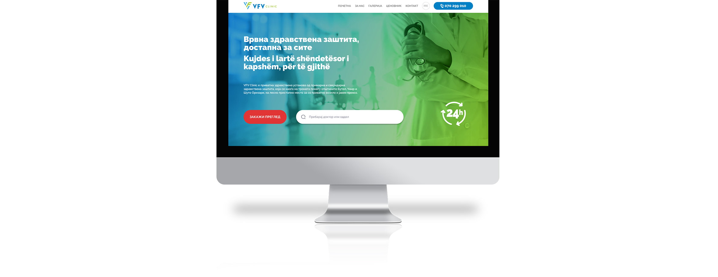
VFV Clinic
Hospital website design www.vfvclinic.mk
TL,DR
Problem
A new hospital in our city, primarily aiming to promote its departments, the available doctors, and the methods it operates with. Previously present in the market only with a pharmacy, now they are expanding with a hospital as well.
Solution
As a newly opened hospital, the only access to information was limited to people who potentially would use it. This is where I extracted the necessary information, leading to the decision for the design itself.
Results
According to my recent awareness of the hospital's operations, specifically the use of the website for scheduling, it provides a clear indicator of a good percentage of scheduled patients.
Problem definition
The primary focus of the hospital is to facilitate calls and appointments for new appointments within the available departments and doctors
Quantitative research
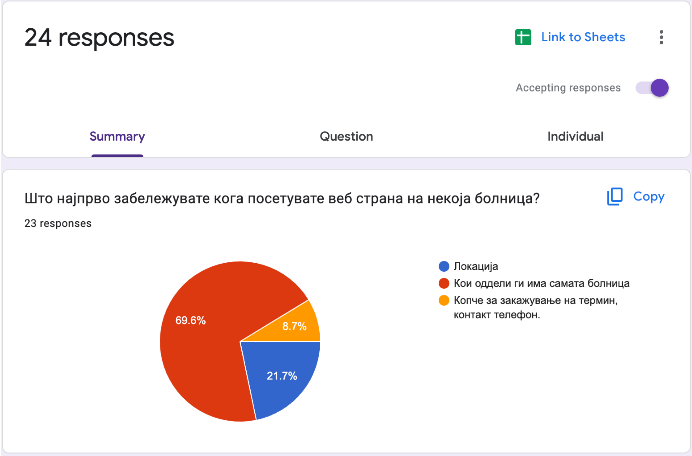
In this quantitative research, 24 individuals aged between 20 and 60 were included, which served as a guide to understanding what patients prefer when visiting a hospital website. I also conducted competitive research, and within the questionnaire, there was a question about what is lacking on other hospital websites.

Analysis of the data from the conducted research.
Based on the data obtained from the respondents, I already had a clear vision of how the website should look and what information it should cover, according to the insights gathered from the patients.
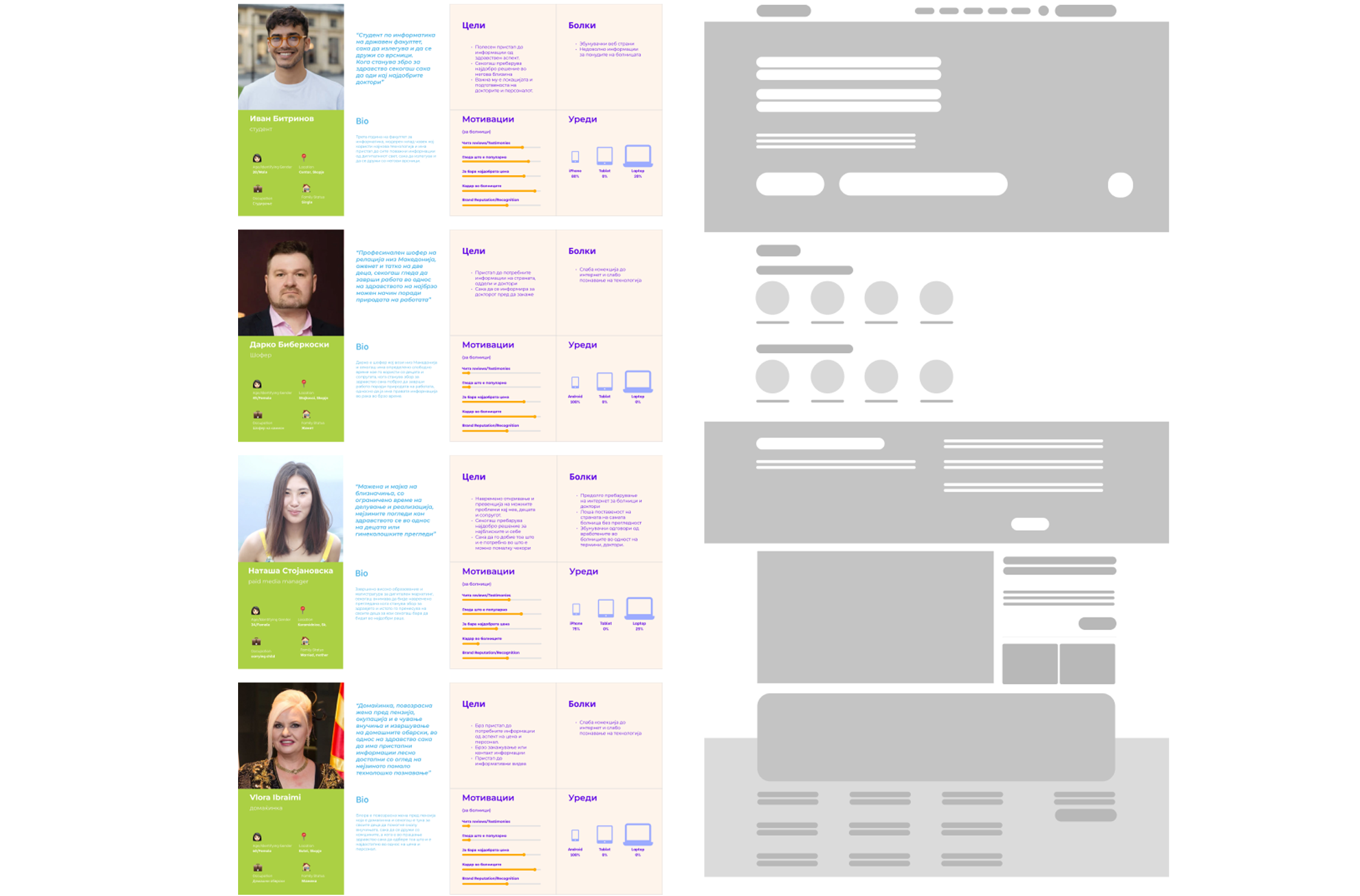
Personas, ideation, wireframing.
I developed 4 personas that would represent the 4 groups of people included in the research. I started ideation based on these personas, ultimately leading to the proposal on the right side. According to the obtained data, patients find it most important to see which departments the hospital has, which doctors are part of it, and what technologies they have at their disposal.

First iteration
Based on the wireframe presented to the stakeholders and reviewed by 3 patients, decisions were made on which parts to proceed with for the specific design.

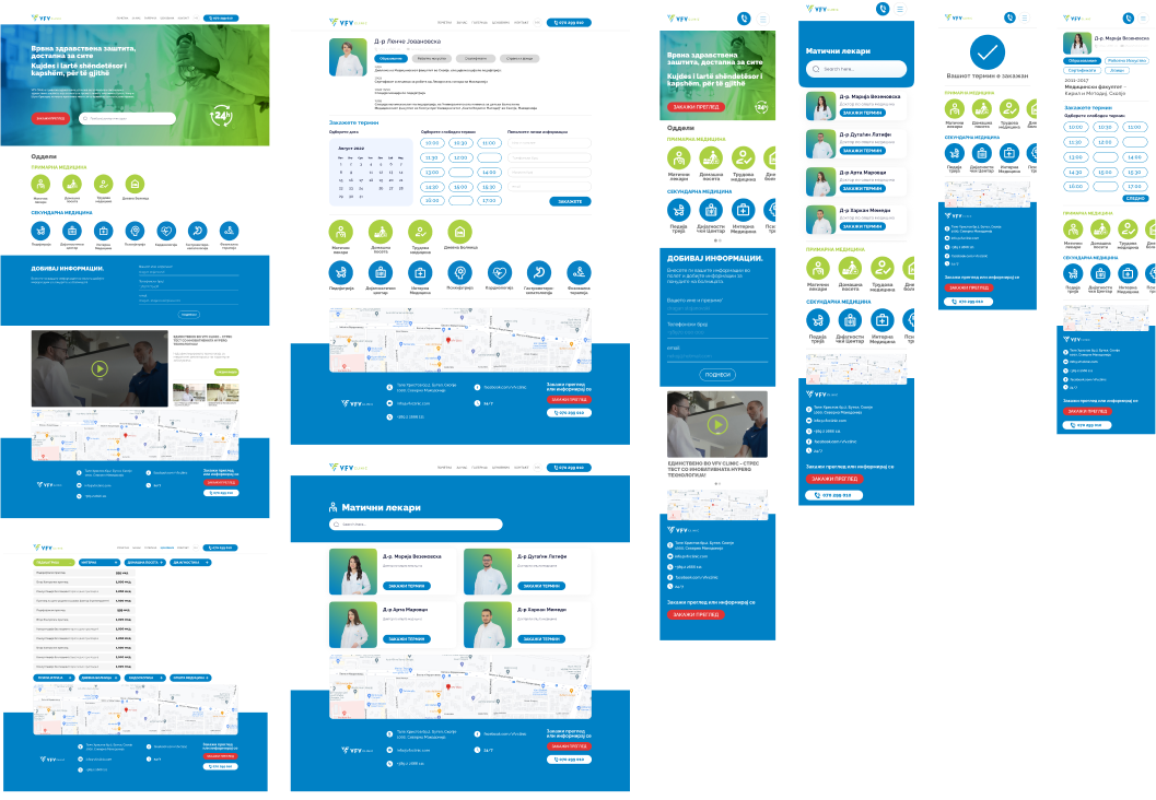
Final design and prototyping
After completing the first phase (wireframe iteration), the next phase was the final design. Here, I applied established UX principles to build a stable user experience design for the web. In this design, elements are clearly visible, with a primary focus on the CTA button and the search bar (where users can search for a department or doctor), placed next to the button.
The second section is the department section, listing all the departments in the hospital. According to the respondents, it was crucial to see which departments the hospital has. By clicking on the departments, users can access information about the available doctors in that department.
The third section is designed for patients to leave their contact information to be informed about the current offers and services the hospital has at that moment (hook method).
The fourth section is primarily about the hospital, showcasing the technologies available through videos and questions to the doctors. This section is crucial for the hospital to provide an overview of its capabilities and services.

Second (final) iteration
After creating the final design, it was presented to stakeholders and patients, from whom I received feedback about the design itself and identified areas that might need improvement. From there, the implementation of the web design continued.
Conclusion:
Challenges and Learnings: Working on this type of design, where the primary visitors to the site would be users with health concerns, gave me another perspective on things. Specifically, I had to put myself in the shoes of a user to see how they would perceive the site. Through research, I also realized that if the site incorporates calming elements at the very beginning in terms of colors, text, and image selection, it would instill a sense of security among potential users.
Future Recommendations: There is always room for improvement in a product from the moment it is initially launched, and in the future, I would add some enhancements that were not included in the initial version. For example, financial transparency (some respondents expressed a desire for clear pricing), online appointment scheduling (although there is a design now, it is not part of the current version), a blog section, or a section for patient testimonials.